Molehill Studio
Mobile App Design
Moleskine needed a social platform for their Smart Notebook users.
I developed an onboarding experience in order for like-minded users to connect with each other.
Team: Ivette Ferreras Spesia, Laura Guiral Cuervo, Opeyemi Fadiyimu, Vanessa Scales, Tally Ozegbe
Role: UX/UI Designer
Tools: Figma, Figma Make
Timeline: 2.5 week sprint
First, we asked ourselves:
What do people use their notebook for?
Notebooks hold inspiration - ideas, plans, sketches, goals.
Then, we asked users:
What is the ideal online space?
A space that fosters connection among creatives.
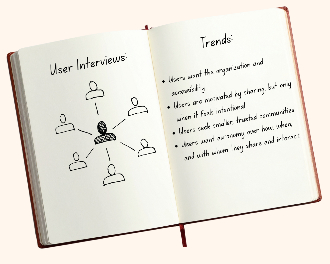
Through our user interviews, we learned that
Creatives have an impersonal experience on current platforms.
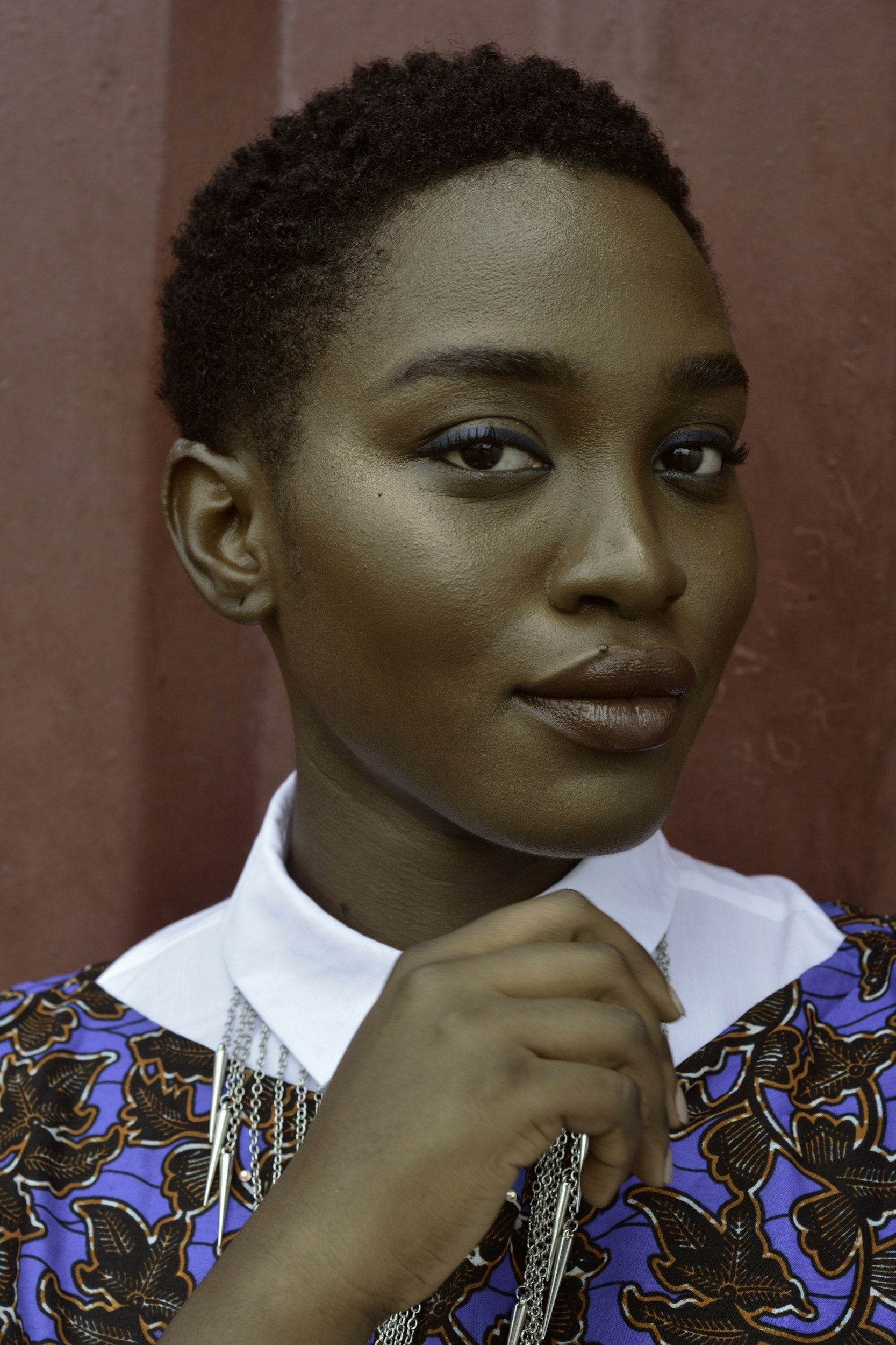
We summarized our users’ experiences by creating the persona “Bay”

The super talented creative that feels immensely uninspired every time she posts on Instagram.
Bay wants an online platform that sparks creativity,
offers collaborative communities, and lets her control what she sees.
Creative to her core
Can catch inspiration anywhere
Naturally private online
Behaviors:
Pressure to post
Limited control over content
Unmoderated negative comments
Pain points from existing social media:
We conducted market research and learned
A strong onboarding process is critical to a personalized feed.
So what makes a good onboarding process?
Visible progress bar
Easy control over profile visibility

Clear terms and conditions
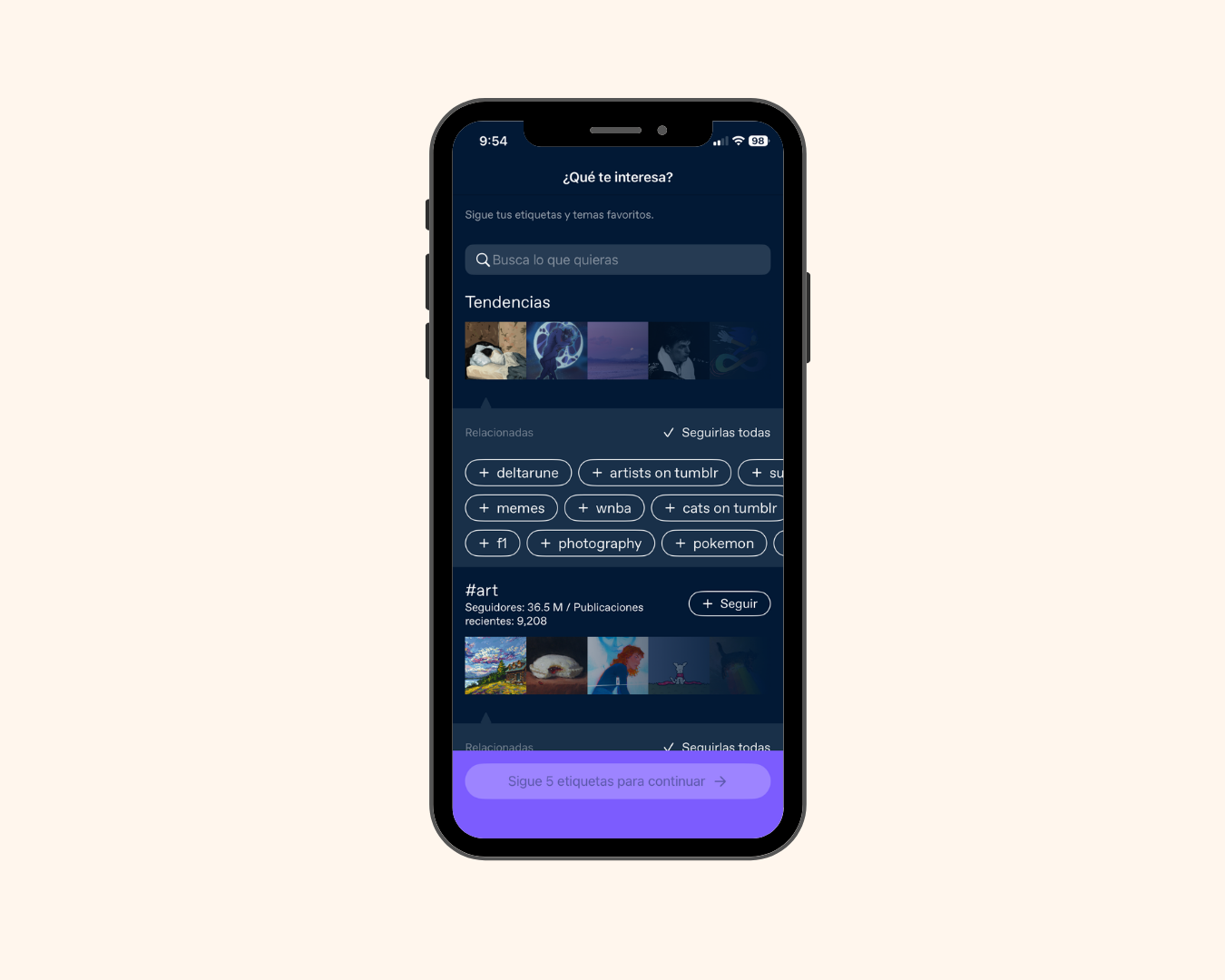

Inviting splash page
Users personalize their feed
To create a unique online space for Moleskine users, we built
Molehill Studio
featuring a strong onboarding experience that builds connection and inspiration.
She completes an onboarding process to connect with like-minded creators.
She controls who sees her content with customizable privacy settings and post visibility.
What does this mean for Bay?
all through the familiarity of her Moleskine Smart Notebook.
The design process
After sketching, we came up with this basic outline

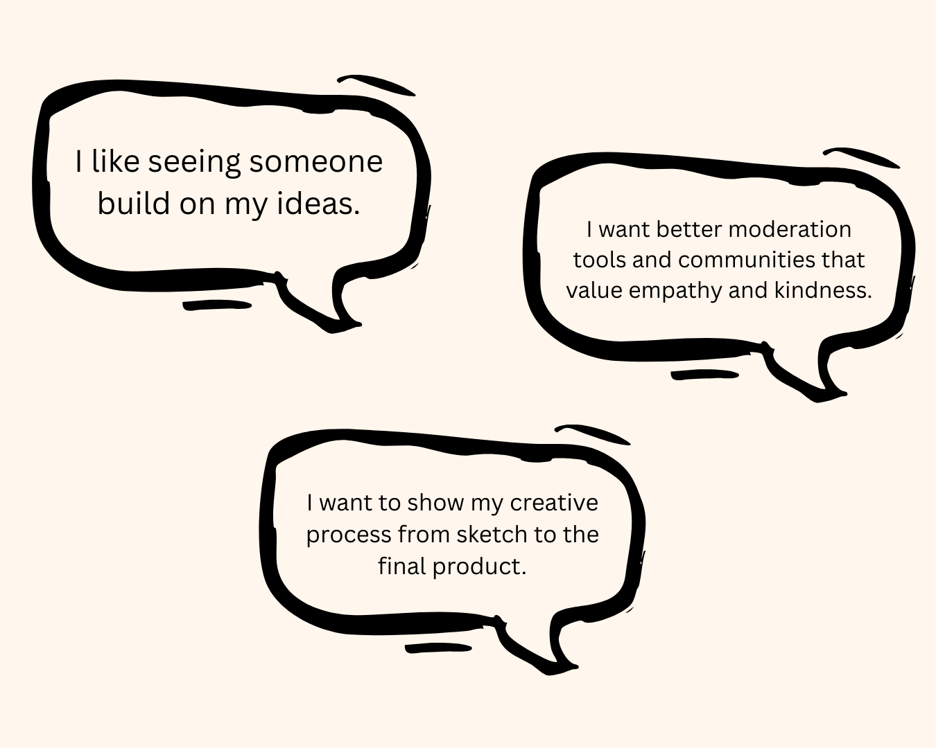
and after testing this
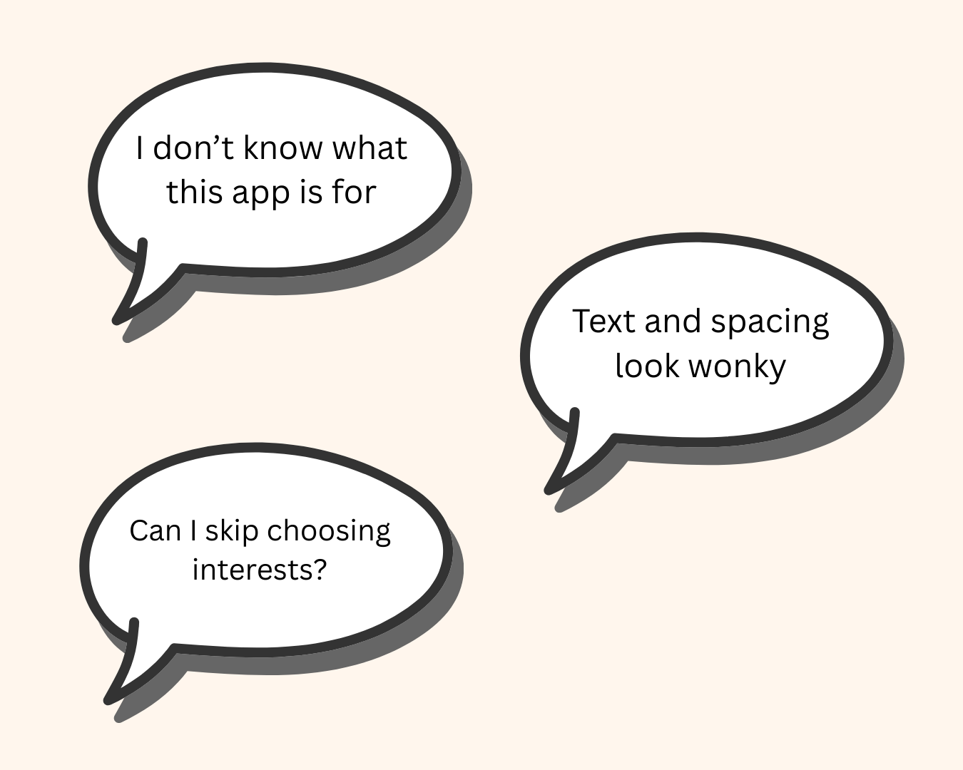
users said:
Details to type of creator page
Improved formatting
Skip options
Small app guide
So we added:

and after more testing
users said:
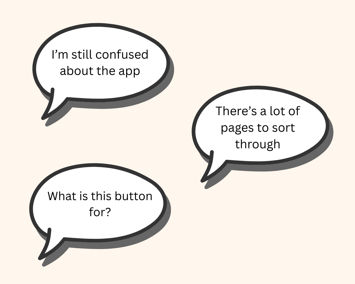
About page
Content preview
Condensed privacy and notifications page
So we added:
From here, we moved forward with
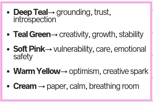
Mood board and branding
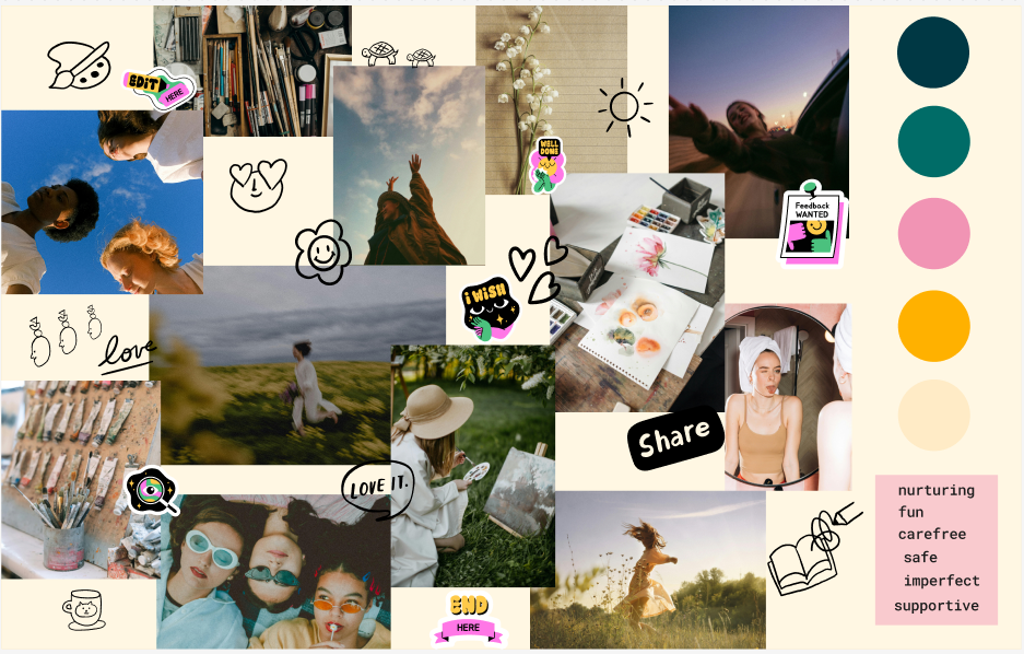
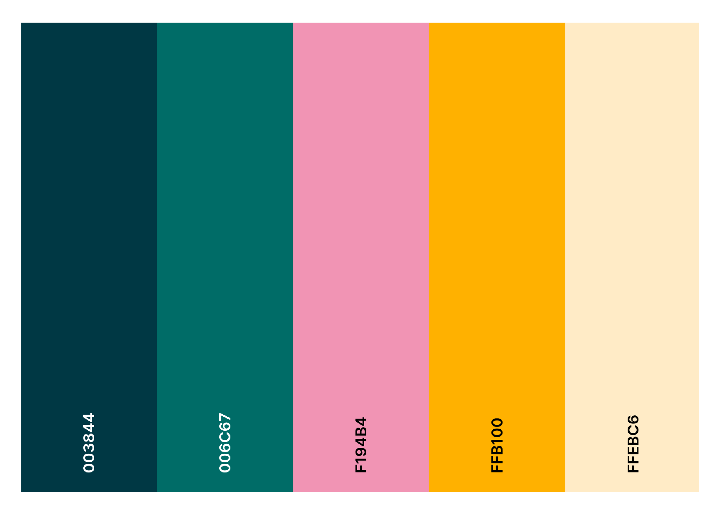
We took our design to Figma Make
To rapidly prototype
Implement branding
Challenge ourselves to work with AI